
Style templates
Navigation: Templates → Style templates
Style templates provide a powerful way to maintain consistent branding and visual identity across your entire ecosystem of applications. These templates function as a central control system for your brand's visual elements, automatically applying your chosen styles to all customer-facing and merchant interfaces.
With a single configuration, your customized colors, logos, backgrounds, and interface elements are seamlessly implemented across multiple platforms—from Mobile Order and POS systems to Customer Displays, Receipts, Kiosks, and Pick-up Displays. This ensures brand consistency while eliminating the need to manually style each application individually.
Tabs
Style template showcasing options for managing various display aspects within apps:
Mobile Order: Displays popular menu items with images, descriptions, prices, and availability. Users can view their basket and total cost for a streamlined ordering experience.
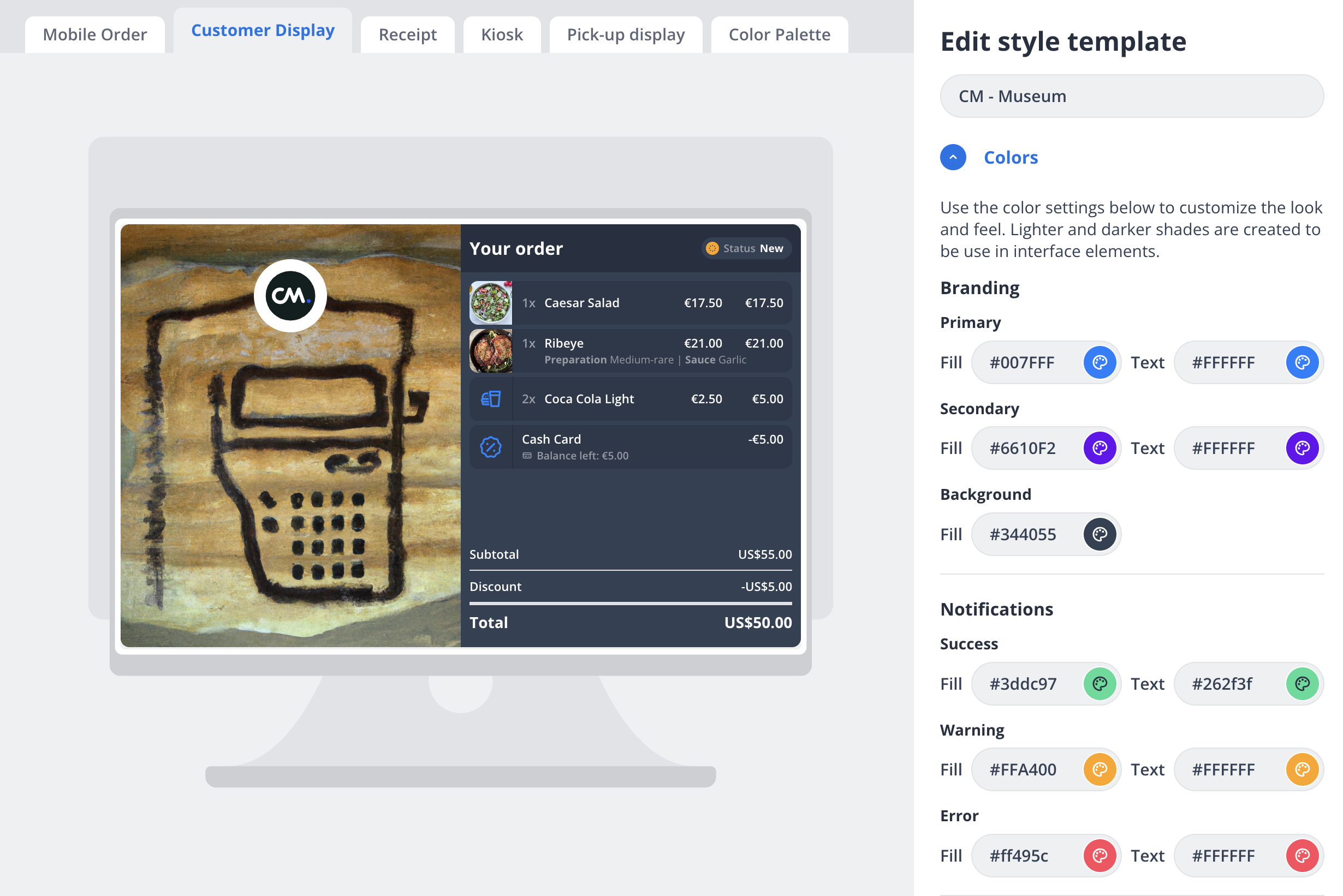
Customer Display: Provides an order summary for customers, including itemized purchases, preparation details, costs, discounts, and total.
Receipt: Formats merchant and transaction details, showing payment method, order ID, date/time, and item overview for well-structured receipts.
Kiosk: Offers navigation for kiosk setup screens, such as Welcome, Menu, Checkout, and Newsletter, enhancing user interaction.
Pick-up Display: Organizes order statuses into "Preparing" and "Ready" categories, using labels for efficient communication.
Color Palette: Allows customization of interface colors, including background, primary, secondary, and status indicators.
This template is designed for efficient management and customization within various app interfaces.
 |  | |
Options
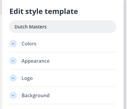
The style template configuration offers detailed customization across several aspects:
Colors:
Customize branding with options for setting 'Primary', 'Secondary', and 'Background' colors using HEX codes.
Notifications can be styled with distinct colors for 'Success', 'Warning', and 'Error', differentiating various states with specific color combinations.
Appearance:
Enable or disable the 'Dark theme' to align with your brand's color palette.
Choose the button style from various options: 'Round', 'Rounded', or 'Square', affecting the overall aesthetic of user interactions within the application.
Logo:
Upload logos in formats such as SVG, JPEG, PNG, or GIF, adhering to a maximum size of 500 KB.
Choose a 'Logo frame' style, options include 'Round', 'Square', or 'None', where frame background fill can also be customized.
Background:
Set the main background image using JPEG, PNG, or GIF formats, with a size limit of 1 MB, providing a visual backdrop for the interface.
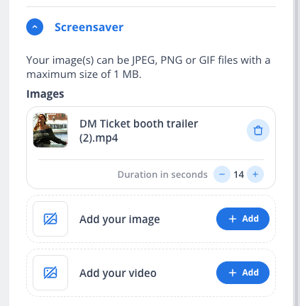
Screensaver:
Configure screensavers using images or videos, accepting formats like JPEG, PNG, GIF, or MP4, with a maximum file size of 1 MB.
Define the duration for display in seconds, adding a dynamic visual element to idle screens.
Newsletter (for Kiosk only):
Facilitate a post-payment newsletter sign-up with fields for adding images and titles.
Include a description and link to a privacy policy, enabling kiosks to engage customers in a personalized manner.
These options offer comprehensive styling capabilities to align the interface with brand identity and enhance user experience across applications.