
User Interaction
The User Interaction Step enables interaction with users by asking questions, collecting input, and validating responses. This step is highly configurable, allowing you to define the question, provide quick reply options, validate user input, and handle invalid responses. Below is a detailed explanation of its key fields and functionalities, incorporating the clarifications provided. We make a distinction between text based user interactions and media reply user interactions (you can switch between the two by toggling the media_reply button).
Text based user interactions
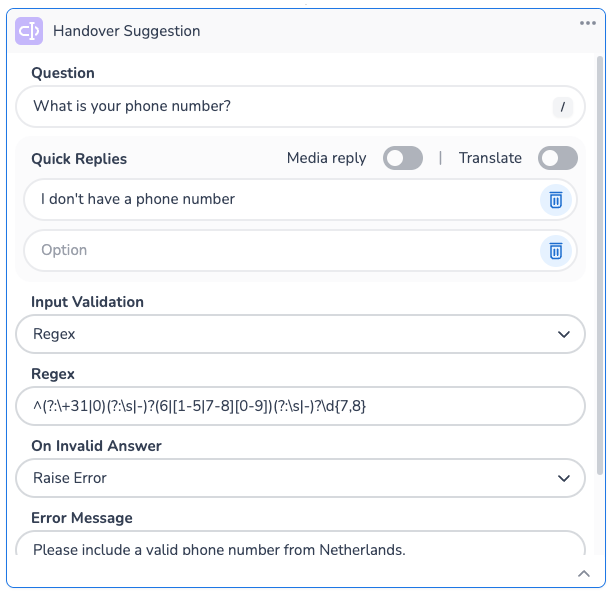
Phone Number Regex Validation
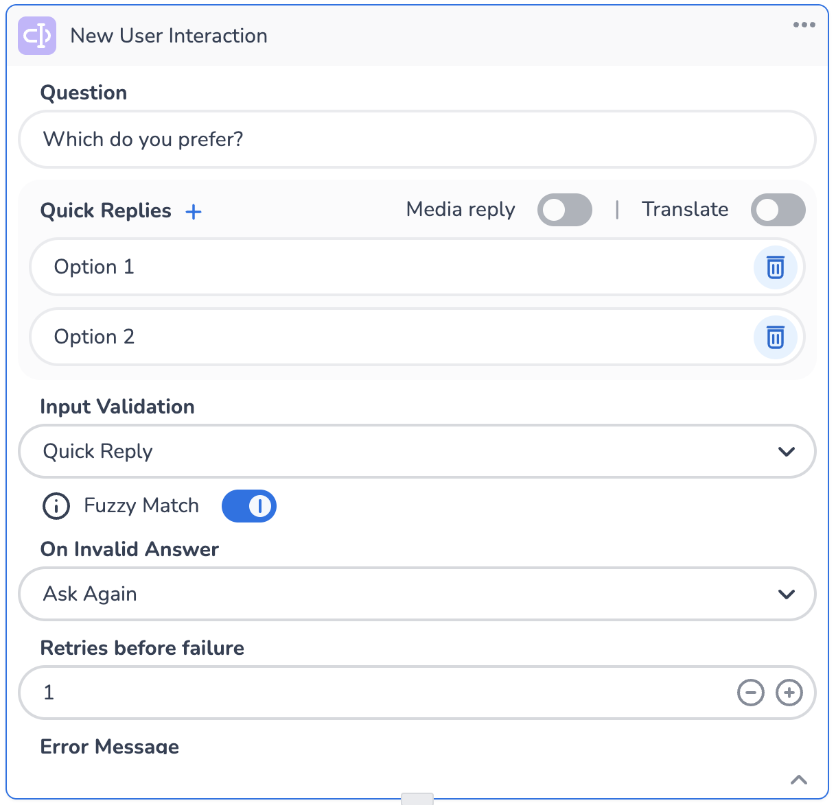
Quick Reply Validation
Key Fields and Functionalities
Question
This is the main prompt displayed to the user.
You can inject parameters, variables, or context values into the question field to dynamically customize the message.
The Translate toggle allows you to enable or disable automatic translation of the question into the user's preferred language.
Quick Replies
Quick replies are predefined response options that users can select instead of typing a free-text answer.
You can add multiple quick replies by clicking the + button.
You can inject parameters, variables, or context values into the quick replies field to dynamically customize the replies. NOTE: if the provided variable is a list of strings, each element in the list will automatically be provided as a single reply.
Input Validation
Input validation ensures that the user's response meets specific criteria.
You can choose from several validation types, such as Email, Regex, Quick Replies, or None:
Email Validation: Ensures the input is a valid email address.
Regex Validation: Allows you to define a custom regular expression to validate the input.
Quick Replies: Only allow for an input from the Quick Replies list
Fuzzy matching - understanding variations: Fuzzy matching allows HALO to interpret user input that doesn’t exactly match predefined options. For example, if a user says, “I’ll take the first one,” HALO Voice can map this to the predefined option “Option 1.”
None: No validation is applied.
On Invalid Answer
Defines how the tool should handle invalid user input. Options include:
Ask Again: Re-prompts the user to provide a valid answer. If this option is selected, you must specify a value greater than 0 in the Retries Before Failure field.
Raise Error: Stops the execution and raises an error.
You must also configure an Error Message to display when the input is invalid. For example, "Please try again in the following format..." or "Error. Invalid."
Error Message
A customizable message is displayed to the user when their input is invalid.
This field is required when input validation is enabled. For example, you can guide the user with messages like "Please try again in the following format..." or "Error. Invalid."
Example Use Cases
Collecting User Email: Use the Email validation type to ensure the user provides a valid email address. If the input is invalid, re-prompt the user with a helpful error message and retry the operation a specified number of times.
Custom Input Validation: Use Regex to validate specific patterns, such as phone numbers, postal codes, or custom formats.
Guided Responses: Provide quick replies to simplify user interaction and ensure the response matches one of the predefined options. Match these with the Qucik Replies validation type to make sure the answers come in the expected format.
Media reply user interactions
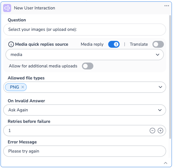
The Media File Interaction feature allows users to interact with files during a conversation by selecting from previously uploaded media or uploading new ones. When enabled, you can select the variable/context holding the media files and they will appear as quick reply options. Always specify allowed file types for validation of both existing and new uploads. This ensures all files meet your requirements before proceeding with the interaction.
Media reply validation
Key Fields and Functionalities
Question (similar to text based user interaction)
This is the main prompt displayed to the user.
You can inject parameters, variables, or context values into the question field to dynamically customize the message.
The Translate toggle allows you to enable or disable automatic translation of the question into the user's preferred language.
Media Quick Replies source
Select the variable or context where the media messages are stored. Generally speaking you would want this to remain at the default value where it uses the
mediasystem context.
Allow for additional media uploads
This toggle determines if new files can be added by the user when prompted with the quick replies.
Allowed File Types
When using media replies, you are required to define the allowed file types. This will do two things. Firstly, it will only show the allowed files in the reply list to the user. Secondly, it will validate the type of the file if you allow for additional media uploads.
Currently the supported file types are:
pdf,jpg,png,webp, andgif.
On Invalid Answer (similar to text based user interaction)
Defines how the tool should handle invalid user input. Options include:
Ask Again: Re-prompts the user to provide a valid answer. If this option is selected, you must specify a value greater than 0 in the Retries Before Failure field.
Raise Error: Stops the execution and raises an error.
You must also configure an Error Message to display when the input is invalid. For example, "Please try again in the following format..." or "Error. Invalid."
Error Message (similar to text based user interaction)
A customizable message is displayed to the user when their input is invalid.
This field is required when input validation is enabled. For example, you can guide the user with messages like "Please try again in the following format..." or "Error. Invalid."
Example Use Cases
Selecting media for upload: Allow users to choose from their previously uploaded media files or add new ones by configuring allowed file types. The selected file can be used in future steps, e.g. uploaded to an external system.