This section appears inside:
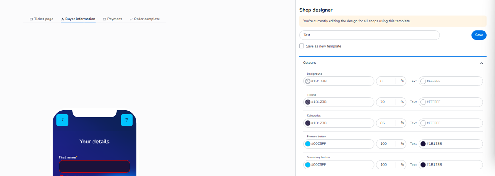
Design → Shop design → Edit → Buyer information → Colours
It controls the colour styling of the Buyer Information step in the checkout flow.
This is the page where customers enter their personal details (e.g. name, email, phone number).
What This Section Means
The Colours section allows you to configure the visual styling of:
-
Background
-
Input fields
-
Form sections
-
Buttons
-
Text
These settings ensure that the form page remains consistent with your brand while maintaining usability and readability.
All colour changes apply to both Mobile and Desktop layouts.
The layout differs per device, but styling is shared.
What You See in This Section
Similar to the Ticket page, each colour setting includes:
-
HEX colour field
-
Opacity percentage
-
Text colour selector
This gives you full control over contrast and visual hierarchy.
Colour Options Explained
-
Background
Field: Background
Purpose:
-
Defines the overall page background colour for the Buyer Information step.
-
Controls the canvas behind form elements.
Text colour defines the default text on this background.
Opacity controls how strong or subtle the background appears.
-
Tickets / Form Blocks
Field (may be labelled similar to Tickets or form container styling):
Purpose:
-
Defines the colour of the form container.
-
Controls how the input section visually stands out from the background.
This affects:
-
Form box
-
Input grouping areas
-
Section containers
Text colour ensures readability inside the form.
-
Categories / Section Headers
Field: Categories (if visible in this step)
Purpose:
-
Controls styling of section headers within the form.
-
Used for grouping buyer information fields.
Improves structure and visual separation.
-
Primary Button
Field: Primary button
Purpose:
-
Defines the colour of the main action button.
-
Typically used for:
-
“Next step”
-
“Continue”
-
“Proceed to payment”
-
This is the most important conversion button in this step.
Text colour defines the label colour on the button.
-
Secondary Button
Field: Secondary button
Purpose:
-
Defines styling for less prominent actions.
-
Used for:
-
Back button
-
Alternative navigation
-
Should remain visually aligned but less dominant than the primary button.
Form Usability Consideration
Since this page contains input fields, colour contrast is critical:
-
Background vs form container contrast must be clear.
-
Input field text must be easily readable.
-
Button colours must stand out clearly.
Proper colour selection improves:
-
Completion rates
-
User confidence
-
Accessibility
Mobile / Desktop Behaviour
-
Styling applies to both Mobile and Desktop.
-
The toggle only changes preview layout.
-
No separate configuration per device.
-
Layout adapts responsively, styling remains consistent.
What This Section Controls
Buyer Information → Colours controls:
-
Form page visual styling
-
Input area appearance
-
Button prominence
-
Text contrast
It influences:
-
Form readability
-
Checkout clarity
-
Professional look
-
Conversion performance
It does NOT control:
-
Field validation
-
Required fields
-
Data logic
-
Payment configuration
Functional Summary
Within Buyer information → Colours, the user can:
-
Define background colour
-
Style form containers
-
Adjust section header appearance
-
Set primary and secondary button colours
-
Control text contrast and opacity
This section ensures the personal details form aligns with your brand while remaining clear and user-friendly.