Navigation: Templates → Style templates
Style templates provide a powerful way to maintain consistent branding and visual identity across your entire ecosystem of applications. These templates function as a central control system for your brand's visual elements, automatically applying your chosen styles to all customer-facing and merchant interfaces.
With a single configuration, your customized colors, logos, backgrounds, and interface elements are seamlessly implemented across multiple platforms—from Mobile Order and POS systems to Customer Displays, Receipts, Kiosks, and Pick-up Displays. This ensures brand consistency while eliminating the need to manually style each application individually.
Tabs
Style template showcasing options for managing various display aspects within apps:
-
Mobile Order: Displays popular menu items with images, descriptions, prices, and availability. Users can view their basket and total cost for a streamlined ordering experience.
-
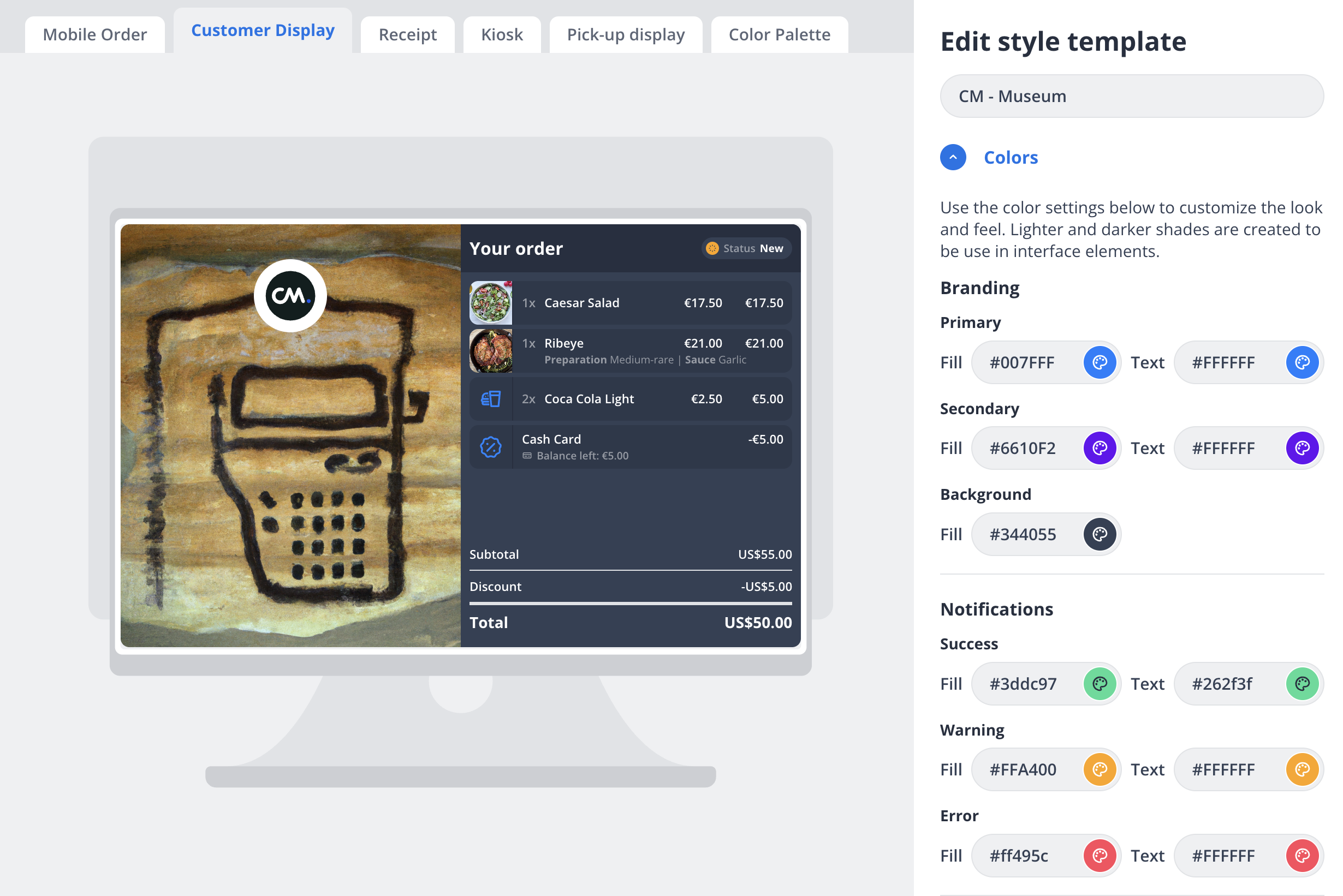
Customer Display: Provides an order summary for customers, including itemized purchases, preparation details, costs, discounts, and total.
-
Receipt: Formats merchant and transaction details, showing payment method, order ID, date/time, and item overview for well-structured receipts.
-
Kiosk: Offers navigation for kiosk setup screens, such as Welcome, Menu, Checkout, and Newsletter, enhancing user interaction.
-
Pick-up Display: Organizes order statuses into "Preparing" and "Ready" categories, using labels for efficient communication.
-
Color Palette: Allows customization of interface colors, including background, primary, secondary, and status indicators.
This template is designed for efficient management and customization within various app interfaces.
|
|
|
Options
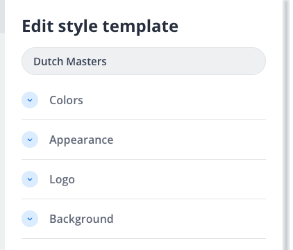
The style template configuration offers detailed customization across several aspects:
-
Colors:
-
Customize branding with options for setting 'Primary', 'Secondary', and 'Background' colors using HEX codes.
-
Notifications can be styled with distinct colors for 'Success', 'Warning', and 'Error', differentiating various states with specific color combinations.
-
-
Appearance:
-
Enable or disable the 'Dark theme' to align with your brand's color palette.
-
Choose the button style from various options: 'Round', 'Rounded', or 'Square', affecting the overall aesthetic of user interactions within the application.
-
-
Logo:
-
Upload logos in formats such as SVG, JPEG, PNG, or GIF, adhering to a maximum size of 500 KB.
-
Choose a 'Logo frame' style, options include 'Round', 'Square', or 'None', where frame background fill can also be customized.
-
-
Background:
-
Set the main background image using JPEG, PNG, or GIF formats, with a size limit of 1 MB, providing a visual backdrop for the interface.
-
-
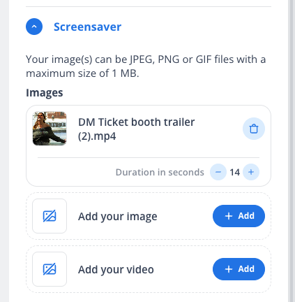
Screensaver:
-
Configure screensavers using images or videos, accepting formats like JPEG, PNG, GIF, or MP4, with a maximum file size of 1 MB.
-
Define the duration for display in seconds, adding a dynamic visual element to idle screens.
-
-
Newsletter (for Kiosk only):
-
Facilitate a post-payment newsletter sign-up with fields for adding images and titles.
-
Include a description and link to a privacy policy, enabling kiosks to engage customers in a personalized manner.
-
These options offer comprehensive styling capabilities to align the interface with brand identity and enhance user experience across applications.