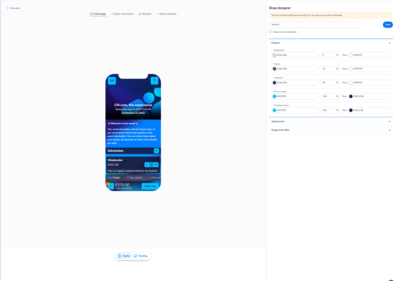
This screen appears when editing an existing shop design inside:
Dashboard → Design → Shop design → Edit
This is the visual shop editor where you configure the look and feel of the ticket sales page.
It controls the branding and layout of the online shop that customers use to purchase tickets.
Top Navigation Tabs
At the top of the editor, you see multiple steps representing the checkout flow:
-
Ticket page
-
Buyer information
-
Payment
-
Order complete
These tabs allow you to preview and configure the design for each step of the purchase journey.
-
Ticket Page
This is the first step of the checkout flow.
It includes:
-
Event header
-
Event description
-
Ticket categories
-
Ticket selection controls
-
Pricing overview
-
“Next step” button
This page controls how customers select tickets.
-
Buyer Information
This step shows:
-
Personal details form
-
Required input fields
-
Layout of form sections
Here you define how the form is visually styled when customers enter their details.
-
Payment
This step controls the appearance of:
-
Payment method selection
-
Payment summary
-
Final confirmation before purchase
It defines how the payment screen visually aligns with your branding.
-
Order Complete
This is the confirmation screen after a successful purchase.
It includes:
-
Order confirmation message
-
Summary overview
-
Final status display
This ensures consistent branding through the full customer journey.
Preview Area (Center)
In the middle of the screen, you see a live preview of the shop.
This shows:
-
Event header styling
-
Ticket blocks
-
Buttons
-
Layout structure
Changes made in the right panel immediately reflect in the preview.
Mobile / Desktop Toggle
Below the preview, you see:
-
Mobile
-
Desktop
Important clarification:
There is no functional difference between Mobile and Desktop settings.
-
You are editing the same shop design.
-
All changes apply to both versions.
-
The toggle only changes how the layout is displayed in the preview.
Mobile shows a vertical stacked layout.
Desktop shows a wider layout.
The configuration is shared — only the visual preview differs.
Right Side – Shop Designer Panel
On the right side, you see the configuration panel.
This typically includes:
-
Template name
-
Save button
-
Colour settings
-
Appearance settings
-
Image & video settings
This panel controls the visual styling of the selected checkout step.
Save & Template Options
At the top right:
-
Save → Apply changes
-
Option to save as new template (if available)
Changes are not active until saved.
What This Editor Controls
The Shop Design Editor controls:
-
Branding colours
-
Button styling
-
Background colours
-
Category appearance
-
Checkout layout styling
-
Visual consistency across the entire checkout flow
It influences:
-
Customer experience
-
Brand perception
-
Visual trust
-
Conversion flow consistency
It does NOT control:
-
Ticket pricing
-
Inventory
-
Payment logic
-
Order processing
-
Capacity allocation
Functional Summary
Within the Shop Design Editor, the user can:
-
Configure design for each checkout step:
-
Ticket page
-
Buyer information
-
Payment
-
Order complete
-
-
Adjust colours and appearance
-
Preview Mobile and Desktop layouts
-
Save and manage shop templates
Mobile and Desktop share the same configuration —
only the preview layout changes between them.