Description:
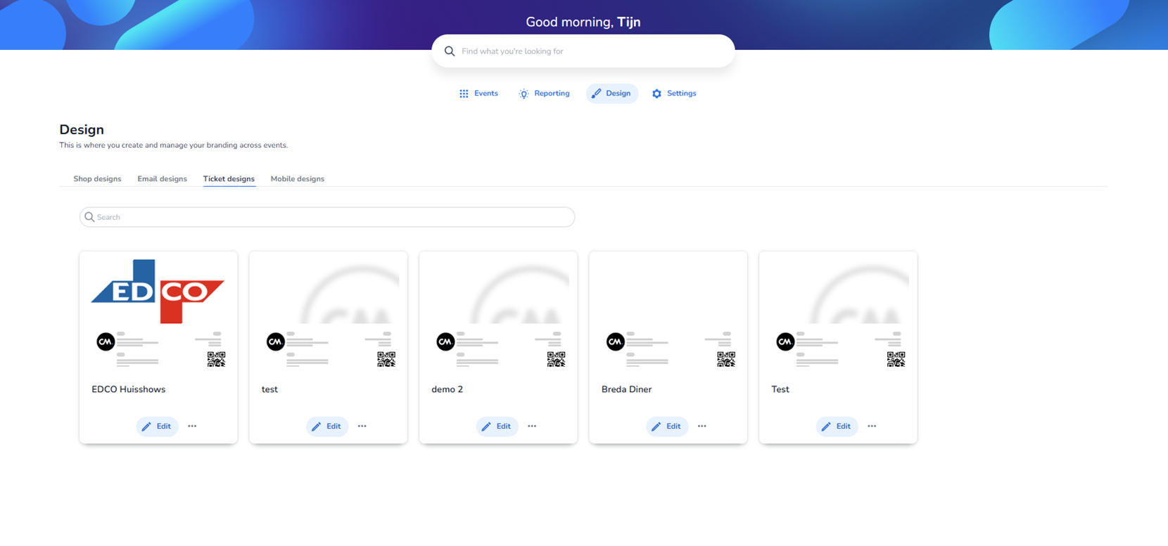
This screen shows the Ticket designs section within the Design dashboard. The Design module is active in the main navigation, and within the design type tabs, Ticket designs is selected.
This area is used to manage branding and layout configurations specifically optimised for ticketing. These designs determine how event-related pages and interactions appear on smartphones.
Top Navigation & Context
At the top of the screen:
-
Main navigation includes:
-
Events
-
Reporting
-
Design (active)
-
Settings
-
Below the page title (“Design”), a short description explains that this section is used to create and manage branding across events.
Design Type Tabs
Four design categories are visible:
-
Shop designs
-
Email designs
-
Ticket designs
-
Ticket designs (active)
The Mobile designs tab is visually highlighted to indicate the current section.
Users can switch to other design types by clicking the respective tab. Each category controls branding for a different touchpoint, but this page focuses solely on mobile-specific templates.
Search Functionality
A search bar appears below the tabs.
-
Allows users to search mobile design templates by name.
-
Useful when managing many templates across different events or clients.
Mobile Design Template Grid
The main content area displays a grid of mobile design cards.
Important note:
The templates shown in the screenshot are test and example designs, not necessarily real production events.
Each card represents a mobile-optimised branding template.
Structure of a Mobile Design Card
Each card contains:
-
Visual Preview
A thumbnail preview that simulates how the mobile interface would look.
Typically includes:
-
A mobile-friendly header layout
-
Banner or hero image
-
Simplified text blocks
-
Mobile-optimised buttons (often centered and visually prominent)
-
Clean spacing and stacked layout structure
The preview helps users quickly recognise styling differences such as:
-
Color schemes
-
Button styles
-
Header background usage
-
Accent colors
-
Template Name
Displayed below the preview image.
Examples shown:
-
Breda Diner
-
Van der Valk
-
New Email Template Group
-
test2
-
Diede’s template editor
-
Volley Haasrode Leuven
-
EDCO Huisshows
-
Stadswandeling - Rotterdam
-
KIKI
-
Padelevent Locatie 1 Sanquin
These represent different branding setups adapted for mobile presentation.
-
Context Menu (Three Dots)
Each card includes a three-dot (ellipsis) button in the bottom-right corner.
Purpose of this small button:
-
Opens a contextual action menu for that specific mobile design.
-
Likely actions include:
-
Edit template
-
Duplicate
-
Delete
-
Assign to event
-
Set as default
-
This allows quick management per design without opening it fully.
Layout Characteristics
-
Templates are arranged in a responsive card grid.
-
Each card has:
-
Subtle shadow for separation
-
Clean white base container
-
Preview area on top
-
Template name below
-
-
The page supports vertical scrolling when more templates exist.
Purpose of the Ticket Designs Section
This page enables users to:
-
Create and manage mobile-optimised branding templates
-
Ensure consistent mobile user experience across events
-
Separate desktop/shop branding from mobile presentation
-
Quickly compare visual differences via preview thumbnails
-
Manage templates efficiently using the contextual menu
Mobile designs are important because mobile traffic often represents a large portion of ticket purchases and event interactions. This section ensures that branding and usability are optimised for smaller screens.