Description:
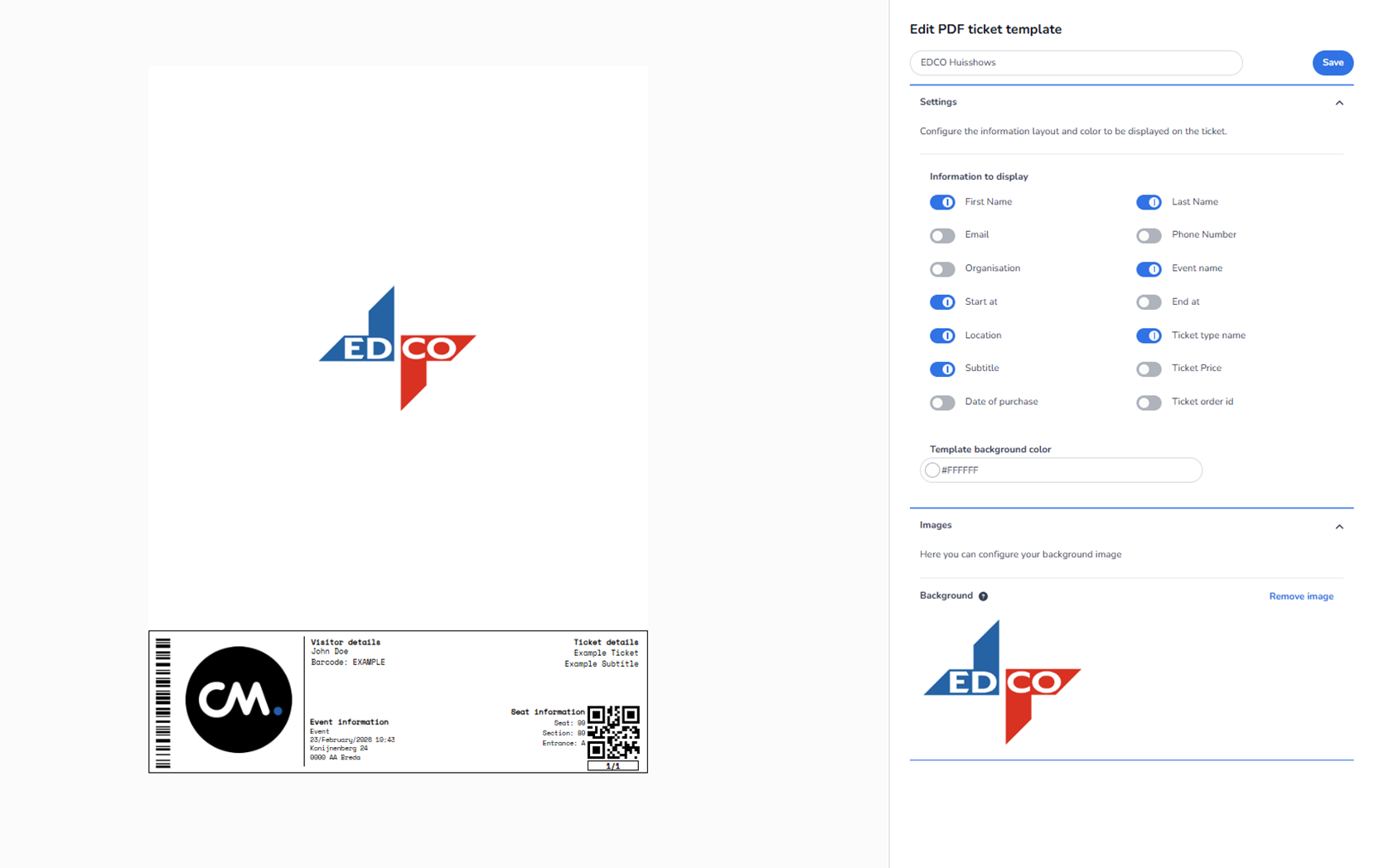
This screen shows the edit interface for a Ticket Design (PDF ticket template). The template name shown (EDCO Huisshows) and the ticket preview content are examples only. They are used to demonstrate layout and configuration options and do not represent how real end users will see their own tickets with live event/order data.
The page is split into two main sections:
-
Left side: PDF ticket preview (visual simulation)
-
Right side: Configuration panel where the ticket template is edited
Left Side – PDF Ticket Preview (Example)
Preview canvas
A large white canvas represents the PDF page where the ticket will be generated.
Background image / branding preview
A large EDCO logo appears in the center of the canvas. This indicates that a background image is configured for the template.
Example ticket (bottom area)
At the bottom of the preview there is a sample ticket showing placeholder content such as:
-
Barcode (left)
-
A large circular CM logo (left side inside the ticket)
-
Visitor details (example name, example barcode)
-
Event information (example event name/date/location)
-
Seat information (example seat/section/entrance)
-
QR code (right)
-
Ticket details (example ticket name/subtitle)
Important:
This ticket is a mock example used to preview structure and visibility of fields. In a real ticket, these fields would be filled with actual customer/event/order data.
The preview updates when settings are changed on the right.
Right Side – Ticket Template Configuration Panel
-
Header controls
Template name input
-
A text field at the top contains the template name: “EDCO Huisshows”
-
Purpose: Rename the ticket template to something meaningful (e.g., per client/event/brand).
Save button
-
Blue button in the top-right: Save
-
Purpose: Saves all changes made in the editor.
-
Key behaviour: Changes are not guaranteed to persist unless Save is clicked.
-
Settings section (expand/collapse)
Settings header + collapse icon
-
The Settings section includes a small chevron/arrow icon.
-
Purpose: Collapse or expand the Settings block to reduce clutter.
Description text
-
Explains that the user can configure both the information layout and color shown on the ticket.
-
Information to display (field toggles)
This is the main control area for what appears on the ticket.
Toggle switch behaviour
-
Blue toggle (ON): the field will be displayed on the ticket
-
Grey toggle (OFF): the field will be hidden from the ticket
These toggles let users decide which personal details, event details, and ticket details are included—useful for privacy and for keeping the ticket clean.
Fields available in this screen
Visitor / buyer-related fields
-
First Name (ON in the example)
-
Last Name (ON)
-
Email (OFF)
-
Phone Number (OFF)
-
Organisation (OFF)
Event-related fields
-
Event name (ON)
-
Start at (ON)
-
End at (OFF)
-
Location (ON)
Ticket-related fields
-
Ticket type name (ON)
-
Subtitle (ON)
-
Ticket Price (OFF)
-
Date of purchase (OFF)
-
Ticket order id (OFF)
What this does in practice
If a user switches a field ON or OFF:
-
the ticket preview on the left updates to include or exclude that data element
-
the exported/generated PDF ticket will follow that configuration after saving
-
Template background color
Background color input
-
Label: Template background color
-
A hex color value field is shown (example: #FFFFFF for white)
Small controls in this field
-
A small color selector control (circle/icon) lets the user visually choose a color.
-
The hex value can also be typed manually.
Effect: Changes the base background color of the ticket template.
-
Images section (expand/collapse)
Images header + collapse icon
-
The Images section has a chevron/arrow to expand/collapse it.
Helper text
-
Indicates that this section is used to configure the template’s background image.
Background image controls
Background label + info icon
-
The label Background includes a small information icon.
-
Purpose: Gives extra explanation (tooltip) about what the background does.
Background image preview
-
Shows a thumbnail of the currently selected background image (EDCO logo in this example).
Remove image button
-
Link/button: Remove image
-
Purpose: Removes the background image from the ticket design.
-
Result: The ticket will rely on the background color only (unless another image is uploaded/set elsewhere).
Bottom-line: what the user can do on this page
With this Ticket Design editor, a user can:
-
Rename the PDF ticket template
-
Choose which fields appear on the ticket (privacy + clarity)
-
Set a background color using hex or a color picker
-
Manage background imagery (view/remove)
-
Preview changes live on an example ticket
-
Save the configuration so it becomes the active ticket template setup