Description:
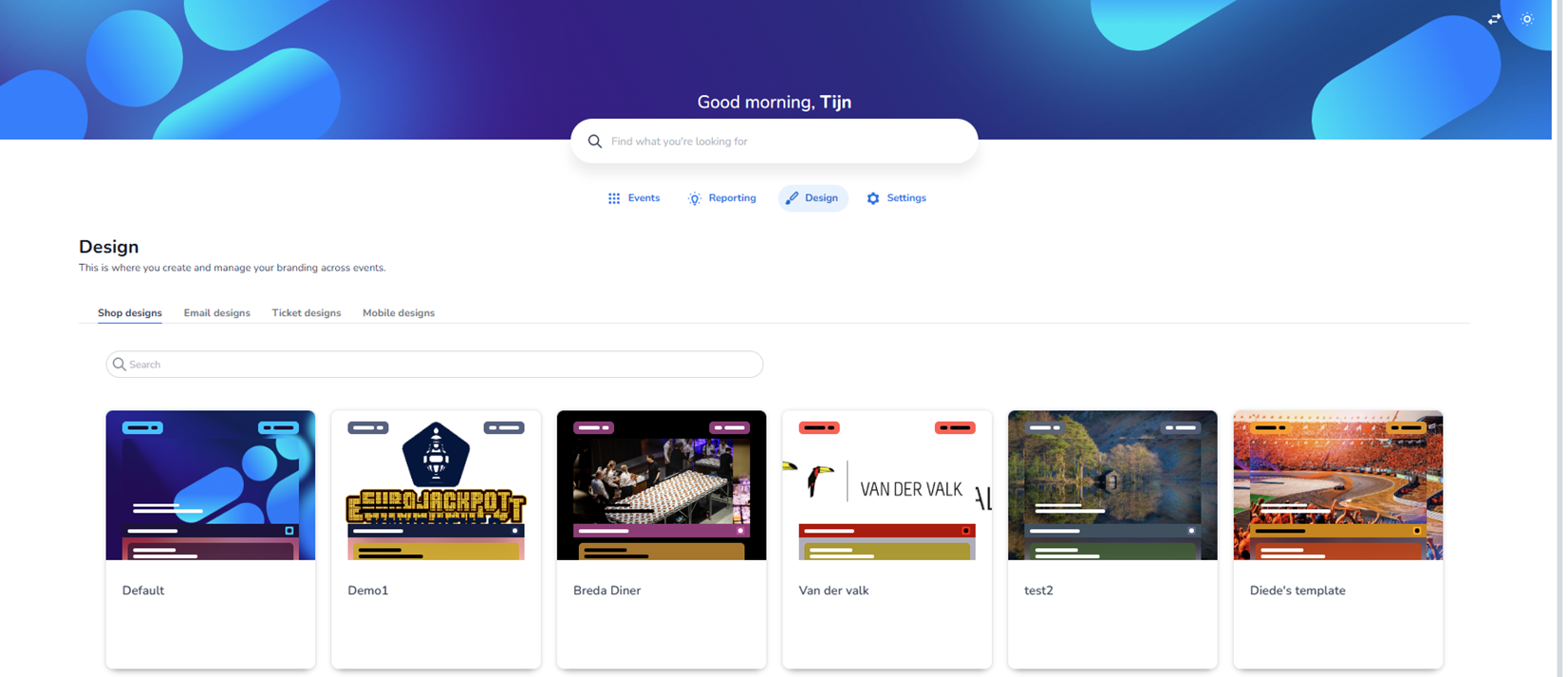
This screen shows the Email designs section within the Design dashboard. The Design module is active in the top navigation, and within the design tabs, Email designs is selected.
This area is used to manage and configure branded email templates that are sent in relation to events, such as confirmations, notifications, or transactional emails.
Top Navigation & Context
At the top of the page:
-
Main navigation includes:
-
Events
-
Reporting
-
Design (active)
-
Settings
-
-
Below the page title (“Design”), there is a short explanation stating that this section is used to create and manage branding across events.
Design Type Tabs
Four design categories are visible:
-
Shop designs
-
Email designs (active)
-
Ticket designs
-
Mobile designs
The selected tab (Email designs) is visually highlighted.
Users can switch to other design types by clicking the respective tab. For now, this page specifically shows email template configurations.
Search Functionality
A search bar is located beneath the tabs.
-
Allows filtering email templates by name.
-
Useful when many templates exist.
Email Template Grid
The main content area displays a grid of email template cards.
Important note:
The designs shown in this screenshot are a mix of test templates and example events. They are not necessarily real production events.
Each card represents a separate email design template.
Structure of an Email Design Card
Each card contains:
-
Visual Preview
A thumbnail mock-up of the email layout showing:
-
Header area (often with logo or banner image)
-
Body text layout
-
Button styling (e.g. blue, green, red call-to-action buttons)
-
Background colors and accent borders
This preview gives a quick visual impression of the branding style.
-
Template Name
Displayed below the preview.
Examples shown:
-
Breda Diner
-
Van der Valk
-
New Email Template Group
-
test2
-
Diede's template editor
-
Volley Haasrode Leuven
-
EDCO Huisshows
-
Stadswandeling - Rotterdam
-
KIKI
-
Padelevent Locatie 1 Sanquin
These names represent different branding setups or email template variations.
-
Context Menu (Three Dots)
Each card has a three-dot menu (ellipsis) in the bottom-right corner.
Purpose of this small button:
-
Opens additional actions for that specific email design.
-
Likely includes options such as:
-
Edit
-
Duplicate
-
Delete
-
Assign to event
-
Set as default
-
The ellipsis icon acts as a secondary action menu per template.
Layout Characteristics
-
The templates are displayed in a clean card grid layout.
-
Each card has:
-
Subtle shadow
-
White background
-
Visual hierarchy (preview on top, name below)
-
-
The layout supports scrolling when many templates exist.
Purpose of the Email Designs Section
This page allows users to:
-
Manage multiple branded email templates
-
Keep branding consistent across event communication
-
Maintain separate styles for different clients or event types
-
Quickly identify templates via visual previews
-
Access advanced actions via the ellipsis menu
Email designs ensure that transactional and communication emails match the event branding (colors, logo, tone, layout).