Description:
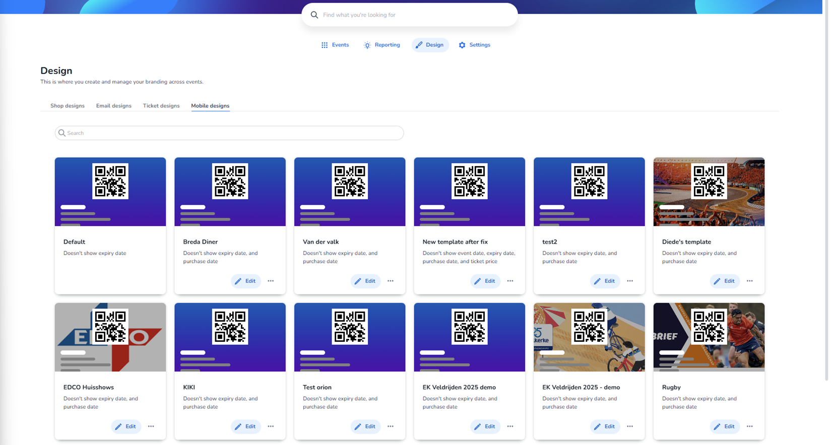
This screen shows the Mobile designs overview within the Design section. The Mobile designs tab is active, meaning the templates shown here control how tickets or event-related views are displayed on mobile devices.
As with the other design sections, the templates shown in this screenshot include example and test templates. They do not necessarily represent live production events.
Page Structure Overview
Top Navigation
At the top of the screen:
-
Main navigation:
-
Events
-
Reporting
-
Design (active)
-
Settings
-
-
Page title: Design
-
Supporting text explaining that this section is used to manage branding across events.
Design Type Tabs
Visible tabs:
-
Shop designs
-
Email designs
-
Ticket designs
-
Mobile designs (active)
Mobile designs is highlighted, indicating the current context.
Search Bar
Below the tabs, there is a search field:
-
Used to filter mobile design templates by name.
-
Helps quickly locate a specific template when many exist.
Mobile Design Template Cards
The main section displays a grid of mobile design cards.
Each card represents a mobile template configuration.
Structure of Each Mobile Design Card
Every card contains the following elements:
-
Visual Preview (Top Section)
-
Shows a simulated mobile-style layout.
-
Includes:
-
QR code placement
-
Text blocks (representing event/ticket details)
-
Color gradient background (often purple/blue in examples)
-
-
Some templates include custom background imagery (e.g., stadium or sports visuals).
This preview represents how the ticket or mobile view would look on a smartphone.
-
Template Name
Displayed directly below the preview.
Examples shown:
-
Default
-
Breda Diner
-
Van der Valk
-
New template after fix
-
test2
-
Diede’s template
-
EDCO Huisshows
-
KIKI
-
Test orion
-
EK Veldrijden 2025 demo
-
Rugby
These represent different branding or layout configurations.
-
Template Description Text
Under each template name, a short description is displayed.
Example:
-
“Doesn't show expiry date”
-
“Doesn't show event date, expiry date, and purchase date”
This text summarizes which information fields are excluded from the template.
Purpose:
-
Quickly understand configuration differences without opening the template.
-
Helpful when managing many similar templates.
-
Edit Button
Each card contains a blue Edit button (with pencil icon).
Purpose:
-
Opens the template configuration editor.
-
Allows adjusting:
-
Visible fields
-
Layout options
-
Colors
-
Possibly QR placement or styling
-
-
Changes made in the editor affect the mobile presentation of the ticket.
-
Three-Dot Menu (Ellipsis)
Next to the Edit button, there is a small three-dot menu.
Purpose:
-
Opens additional actions for the template.
-
Likely options:
-
Duplicate template
-
Delete template
-
Rename
-
Assign to event
-
Set as default
-
This allows management actions without entering the full editor.
Layout Characteristics
-
Templates are displayed in a responsive grid.
-
Each card has:
-
Rounded corners
-
Subtle shadow
-
Clear visual separation
-
-
The page supports vertical scrolling for large template sets.
What This Page Enables
From this overview screen, a user can:
-
View all existing mobile design templates
-
Compare layouts visually
-
Quickly identify what data is shown/hidden
-
Edit a template
-
Perform management actions via the ellipsis menu
-
Search for specific templates
Functional Role of Mobile Designs
Mobile designs are specifically focused on:
-
Smartphone presentation
-
Compact layout
-
QR code prominence
-
Clear readability on small screens
-
Simplified data visibility
They are separate from:
-
Shop designs (purchase flow)
-
Email designs (communication)
-
Ticket designs (PDF output)
Each serves a distinct channel in the ticketing experience.