Description:
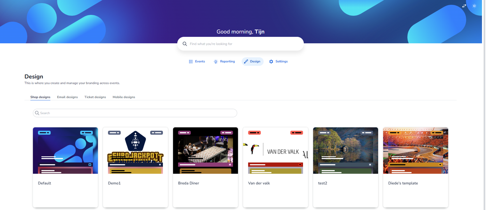
This screen shows the Design section of the dashboard. This area is used to create, manage and maintain branding elements across events. The header clearly states that this is where branding can be managed centrally.
At the top of the page, the main navigation bar is visible with the sections:
-
Events
-
Reporting
-
Design (currently active)
-
Settings
Below the page title (“Design”), there is a short description explaining that this section is used to create and manage branding across events.
Design Categories
Under the page introduction, four design categories are displayed as tabs:
-
Shop designs (currently selected)
-
Email designs
-
Ticket designs
-
Mobile designs
The active tab is visually highlighted.
Although this screen currently shows Shop designs, users can switch between the other design types by clicking on:
-
Email designs
-
Ticket designs
-
Mobile designs
These sections allow different branding configurations for different communication or ticketing touchpoints. We will explore those in more detail later.
Search Functionality
Below the tab navigation, there is a search bar.
-
Purpose: Allows users to quickly find a specific design template by name.
-
Useful when many design templates exist.
Shop Design Cards Overview
The main area of the page displays a grid layout of design cards. Each card represents a design template.
Important note:
The designs shown in this screenshot are test designs and test events, not real production events.
Each card contains:
-
A visual preview of the design (showing layout, colors, banners, buttons, and structure).
-
A small status label at the top (e.g. colored tags indicating draft/test/published states).
-
A design name displayed underneath the preview (e.g. “Default”, “Demo1”, “Breda Diner”, “Van der Valk”, “test2”, “Diede’s template”).
The visual previews simulate how the shop would look when that design is applied to an event.
Card Structure & Indicators
Each design card includes:
-
A preview thumbnail (showing header styling, background image, button styling, etc.).
-
Small colored badges in the top corners (likely indicating status or environment such as test or draft).
-
A name label below the preview.
The cards are arranged horizontally in a responsive grid layout.
Purpose of This Page
This page functions as:
-
A design overview dashboard
-
A central branding management location
-
A template selection and management interface
Users can:
-
View existing design templates
-
Search for specific designs
-
Switch between design types (shop, email, ticket, mobile)
-
Manage multiple branding templates across different events
This ensures branding consistency while allowing flexibility per event or client.