This section appears inside:
Design → Shop design → Edit → Ticket page → Appearance
It controls the structural and stylistic behaviour of elements on the ticket selection page.
While the Colours section defines colour styling, the Appearance section defines layout behaviour, typography, and UI styling.
What This Section Means
The Appearance section allows you to configure:
-
Font style
-
Page layout behaviour
-
Event detail positioning
-
Visibility of description and category headers
-
Button shapes
-
Background blending style
These settings shape the overall look and interaction style of the ticket page.
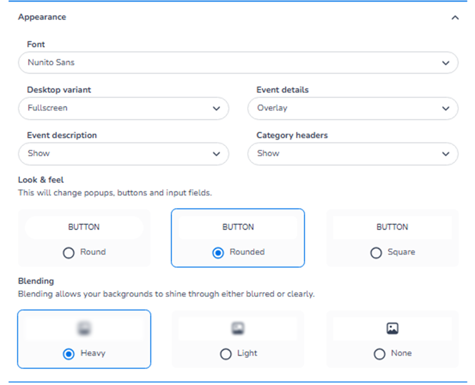
What You See in This Section
-
Font
Field: Font
Purpose:
-
Select the typography used throughout the ticket page.
-
Affects headings, ticket names, descriptions, and buttons.
This ensures consistency with brand guidelines.
Changing the font updates both Mobile and Desktop layouts.
-
Desktop Variant
Field: Desktop variant
Purpose:
-
Defines how the ticket page is displayed on desktop screens.
-
Example option: Fullscreen.
This controls layout structure for larger screens.
Important:
This setting affects layout on Desktop only,
but styling remains consistent across devices.
-
Event Details
Field: Event details
Purpose:
-
Controls how event information is displayed.
-
Example option: Overlay.
Overlay means event details appear layered over the header image.
This impacts the visual emphasis of:
-
Event title
-
Date
-
Location
-
Event Description
Field: Event description
Options typically include:
-
Show
-
Hide
Purpose:
-
Control whether the event description is visible on the ticket page.
Showing it provides context and information.
Hiding it creates a cleaner, minimal layout.
-
Category Headers
Field: Category headers
Options typically include:
-
Show
-
Hide
Purpose:
-
Control visibility of ticket category labels (e.g., Admission, VIP).
Useful when:
-
You want structured grouping.
-
You prefer a simplified ticket list.
Look & Feel – Button Styling
Section: Look & feel
This controls the visual shape of interactive elements like:
-
Buttons
-
Popups
-
Input fields
Options:
-
Round
-
Rounded
-
Square
Purpose:
-
Define the UI personality.
-
Align with modern, corporate, or minimal brand styles.
Rounded styles appear softer and more modern.
Square styles appear sharper and more structured.
Blending
Section: Blending
Description:
“Blending allows your backgrounds to shine through either blurred or clearly.”
Options:
-
Heavy
-
Light
-
None
Purpose:
Controls how background visuals interact with content overlays.
Heavy:
-
Strong blur or overlay effect.
-
High contrast between content and background.
Light:
-
Subtle blending.
-
Background remains more visible.
None:
-
No blending effect.
-
Clear, solid content sections.
This affects visual depth and layering.
Mobile / Desktop Behaviour
-
All styling changes apply to both Mobile and Desktop.
-
The Mobile/Desktop toggle only changes preview layout.
-
Appearance settings are shared across both views.
-
Layout may adapt responsively, but configuration is unified.
What This Section Controls
Appearance controls:
-
Typography
-
Layout structure
-
Visibility of informational blocks
-
Button shapes
-
Background layering effects
It influences:
-
Visual hierarchy
-
Modern vs minimal design
-
Readability
-
User experience
It does NOT control:
-
Ticket logic
-
Inventory
-
Pricing
-
Checkout flow rules
Functional Summary
Within Ticket page → Appearance, the user can:
-
Select font family
-
Configure desktop layout variant
-
Control event detail presentation
-
Show or hide description and categories
-
Define button shapes
-
Adjust background blending effects
This section defines the structural personality and layout behaviour of the ticket selection page.