This section appears inside:
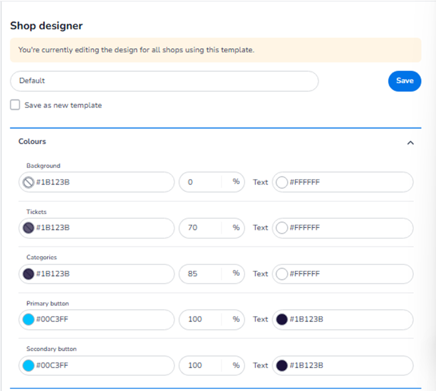
Design → Shop design → Edit → Ticket page → Colours
It controls the colour styling of the ticket selection page in the online shop.
These settings define the visual identity of the first step in the checkout process.
What This Section Means
The Colours section allows you to configure:
-
Background colours
-
Ticket block styling
-
Category styling
-
Primary and secondary button colours
-
Text colours
All changes apply to the ticket page and are reflected in both Mobile and Desktop layouts (layout differs, styling is shared).
What You See in This Section
Each colour setting typically includes:
-
A HEX colour field (e.g. #1B123B)
-
Opacity percentage
-
Text colour selector (where applicable)
This allows precise brand alignment and contrast control.
Colour Options Explained
-
Background
Field: Background
Purpose:
-
Defines the overall page background colour.
-
Controls the base visual canvas behind all ticket elements.
Opacity control allows adjusting how strong or transparent the background colour appears.
Text colour option defines the default text colour placed on this background.
-
Tickets
Field: Tickets
Purpose:
-
Defines the background colour of ticket selection blocks.
-
Controls how individual ticket types are visually displayed.
This affects:
-
Ticket cards
-
Ticket containers
-
Selection areas
Text colour ensures readability inside ticket blocks.
Opacity percentage determines how solid or subtle the ticket block appears relative to the background.
-
Categories
Field: Categories
Purpose:
-
Defines the colour of ticket category headers or grouping sections.
-
Used when tickets are grouped under category labels (e.g., Admission, VIP, Early Bird).
This improves hierarchy and visual structure.
Text colour ensures category titles remain readable.
-
Primary Button
Field: Primary button
Purpose:
-
Defines the colour of the main action button.
-
Typically used for:
-
“Next step”
-
“Continue”
-
Primary call-to-action
-
Opacity is usually set to 100% for strong visibility.
Text colour defines the label colour on the button.
This is one of the most important conversion elements on the page.
-
Secondary Button
Field: Secondary button
Purpose:
-
Defines the styling of secondary actions.
-
Used for less prominent actions (e.g., back buttons, alternative options).
Should contrast clearly with the primary button but remain visually consistent.
Important Behaviour
-
All colour changes apply to both Mobile and Desktop versions.
-
The Mobile/Desktop toggle only changes layout preview — not styling configuration.
-
Changes are reflected instantly in the preview.
-
You must click Save to apply changes.
What This Section Controls
Colours on the Ticket page control:
-
Visual hierarchy
-
Brand identity
-
Button visibility
-
Readability
-
Conversion clarity
It influences:
-
First impression of the shop
-
User navigation clarity
-
CTA visibility
-
Professional appearance
It does NOT control:
-
Ticket pricing
-
Ticket availability
-
Inventory
-
Payment logic
Functional Summary
Within Ticket page → Colours, the user can:
-
Define background styling
-
Configure ticket card appearance
-
Style category headers
-
Set primary and secondary button colours
-
Control text contrast and readability
-
Align the shop with brand guidelines
This section defines the visual identity of the ticket selection experience.